Charts
Leek provides multiple charts giving you insights about the application state.
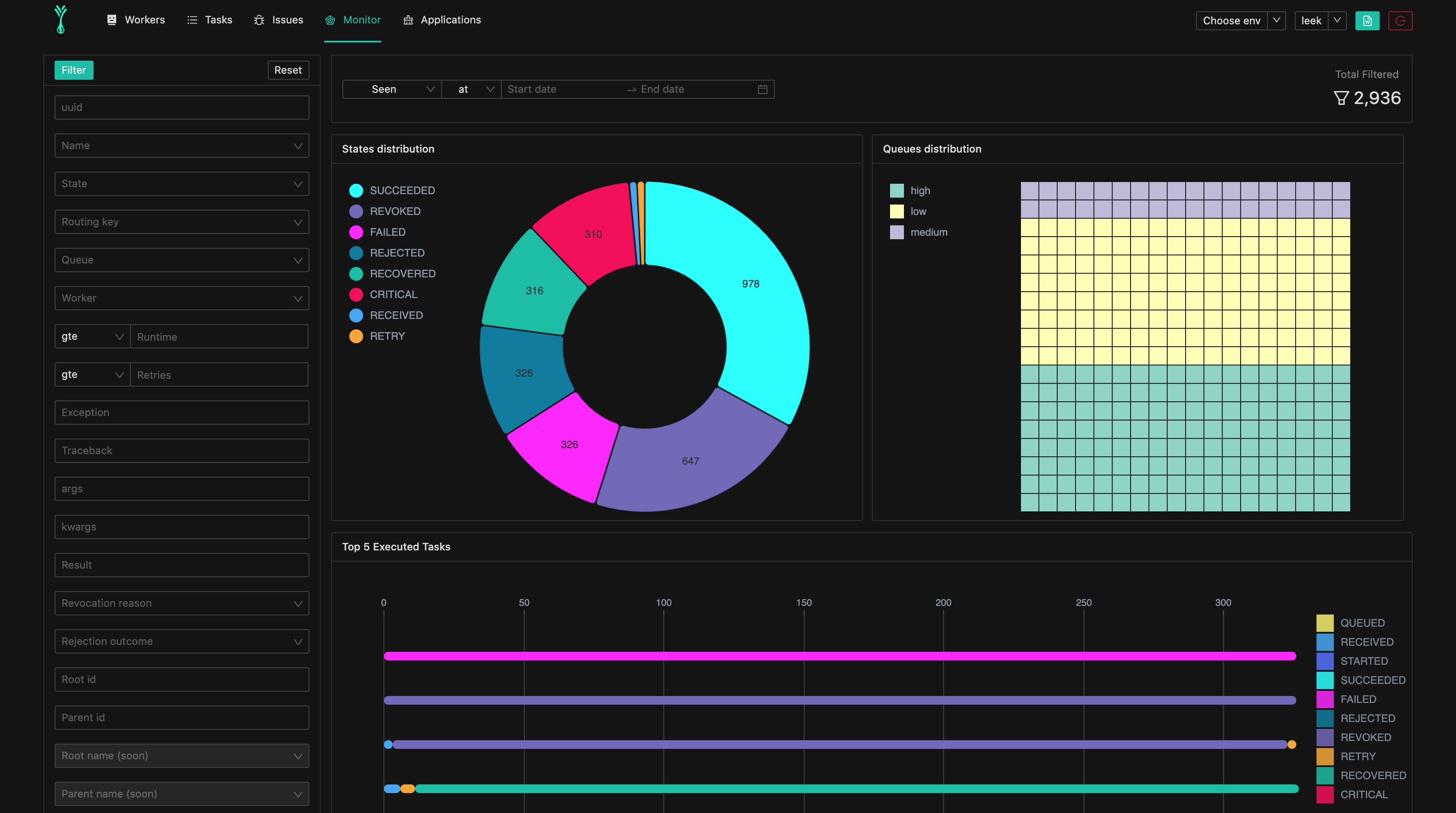
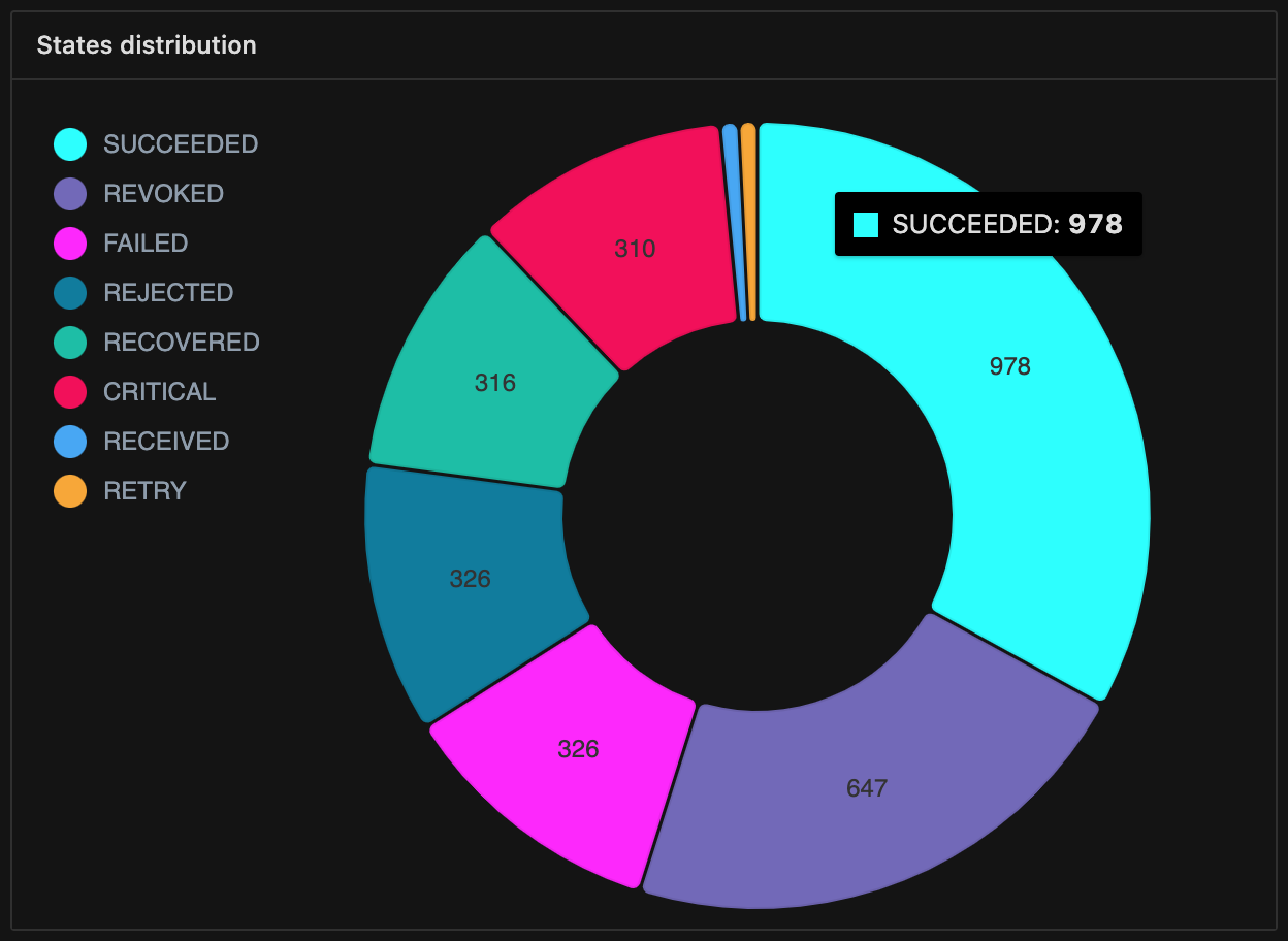
Task states distribution:
A Pie chart with the tasks states distribution, with this chart you can have an idea about application tasks states, this chart is similar to basic metrics on dashboard page, but represented in a visual manner.
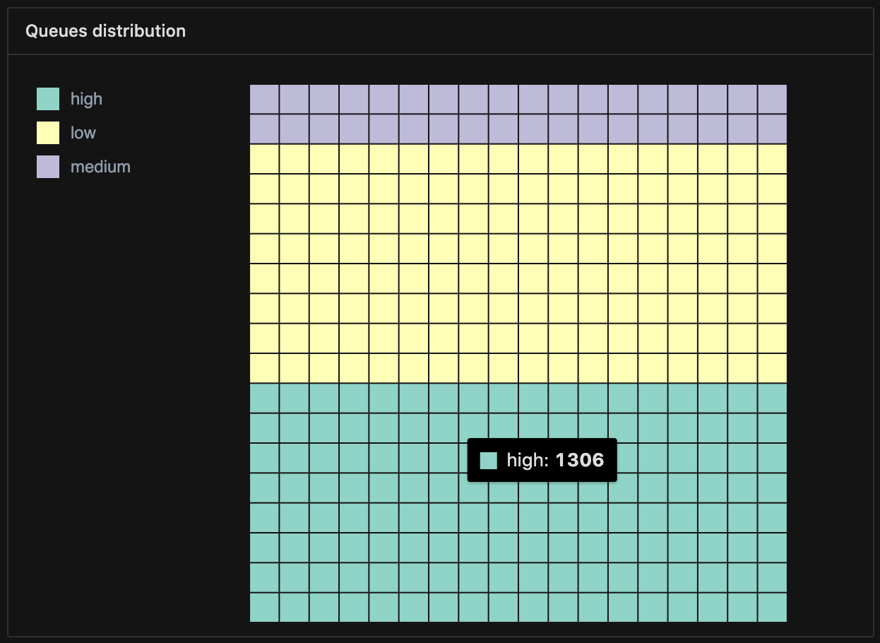
Task queues distribution:
A waffle chart with the tasks queues distribution, with this chart you can have an idea about the current state of each queue.
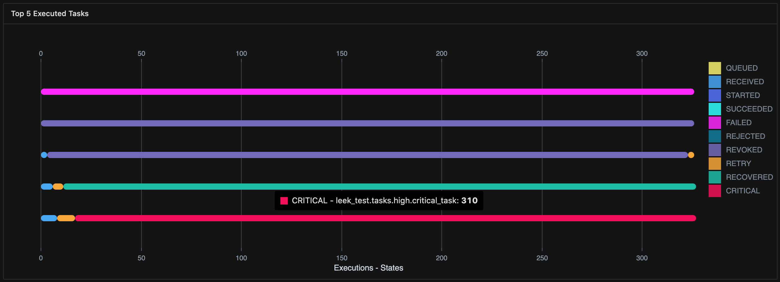
Top 5 Executed Tasks:
A bar chart representing the 5 most executed tasks by aggregating task names and seen states for each task.
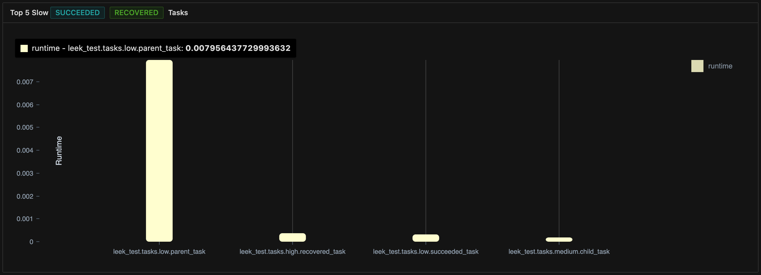
Top 5 Slow Tasks:
A bar chart representing the 5 most slow tasks by grouping tasks by name and calculating the avg time for each group.
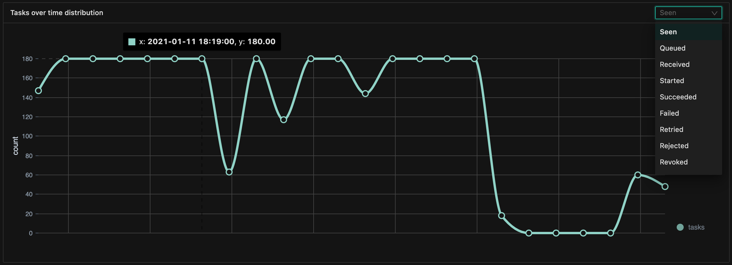
Tasks over time:
A line chart representing the events over time, you can customize this chart to use different types of timestamps, for example:
- if you choose
queuedas timestamp type, the chart will display the queued tasks over time. - if you choose
failedas timestamp type, the chart will display task failures over time.